Showing posts with label promarker tutorial. Show all posts

Monday, 6 December 2010

Melody's Beads - A little tutorial

Good Morning! I've been asked a couple of times how I did the beads on Melody's Dress so thought I'd show you how I created some tones and the bead effect.
For this I've used promarkers, the purples I chose were ORCHID, PURPLE & AUBERGINE. For the beads you will need an opaque white pen, preferably ball point such as Inkssentials.

The image is Flapper Girl Melody by Lemon Shortbread which you'll find HERE.

STEP 1 - Colour your face tones in (previous tutorial here) then use the ORCHID promarker and colour most of the dress and hat in. Next take the PURPLE promarker and add some shading as shown below leaving part of the Orchid showing.


Step 2 - Use your Orchid promarker and colour over all of the hat and dress to blend it with the purple then take the AUBERGINE promarker and add darker shading as below. Colour rings of Aubergine underneath the beads to give a shadow effect. Again use your Orchid and blend all the colours together.


Step 3 - Continue to add Aubergine and blend in with the Orchid, you may need to do this a couple of time until you're happy with the tones achieved. I've added a dark patch on the left hand part of the dress now and under her left hand for a deep shadow.


Adding the beads - For the beads I used a ball point type pen rather than my usual sakura souffle whch has a fatter nib. I used a white opaque pen by Inkssentials and if you press hard it leaves a dint rather than a solid white dot on some of them which gives a good effect :) If you press softly you will get a solid white dot.

Detail of the beads.


Finished Card

Hope you like :)

This weeks celebration specials in the store are: 20% off Decoupage and Scrapbook albums & pages lovely as a christmas present, pop over and have a look.

Vix

Thursday, 20 May 2010

Promarker Tutorial - Hair

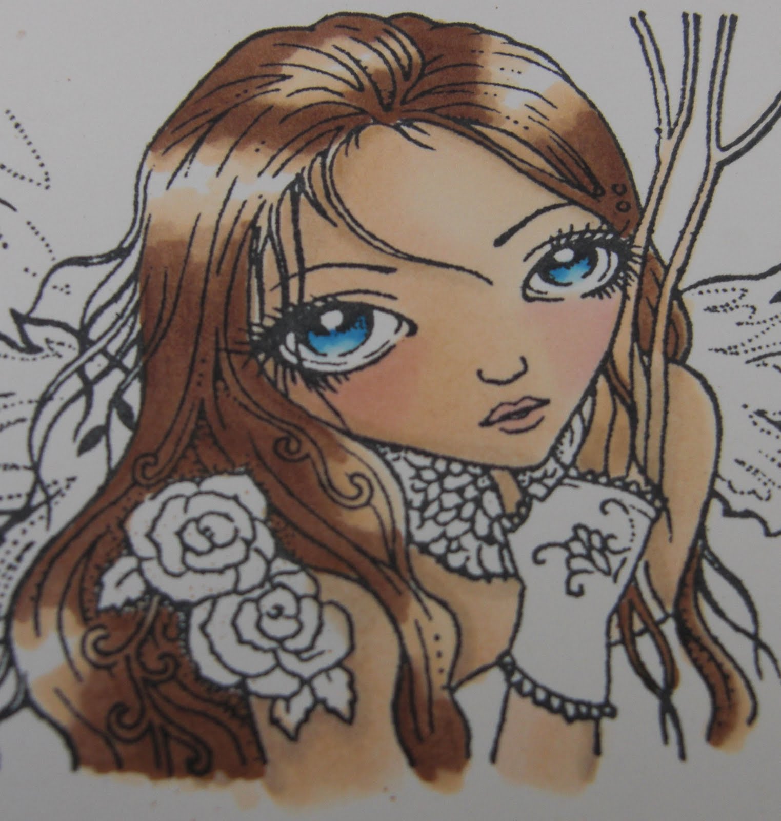
Following on from last weeks tutorial on skin & eyes which is here we're going to move onto the hair! I think once you've mastered these you can colour anything as its all in the blending and colour selection. The image is SEEING THROUGH by Sweet Pea stamps available at CRAFTS AND ME - Here!


You can use any colours for hair but for dark brown as in this image I used...


A light colour for the blender i.e vanilla


A little bit darker i.e Caramel


A medium shade i.e burnt sienna


A dark shade i.e walnut


With hair and clothes you just need to identify highlight and lowlight points. In this example the highlight points on the hair look like bumps and the lowlights are dips.


Colour in your hair with your lightest colour (VANILLA) and leave the highlight points white as shown below.


Next take your little bit darker shade in this case CARAMEL and colour over nearly all of your base colour (VANILLA) leaving just a little bit showing.


Take your medium shade colour (BURNT SIENNA) and colour over most of your image again leaving part of the previous two colours showing.


Go back to your lightest colour (VANILLA) and colour right over the hair again and push the darker shades gradually into the white highlights you left. With a large highlight do this gradually and leave some white showing still, with a smaller highlight run right over it with the vanilla as seen on the smaller highlights at the bottom of the hair.

See how the vanilla washes the colour out and starts blending them together?


Next take your darkest shade (WALNUT) and colour onto the hair leaving quite big bands of the blended colours showing as shown below. The darkest colours really spread out when you blend them so if you only leave a small highlight point, when you blend it will drag too much of the dark colour over and disappear.

Blend this in with the VANILLA again pushing into the highlight points gradually.

Add more of your darkest colour and repeat this as necessary and continue blending in with the vanilla. I usually do this 2 or 3 times then when I'm happy with it I completely cover the white bits once with the vanilla and touch up the very lowest points with the walnut.


Here the hair is completed covering the white completely so that it blends in completely and looks quite natural. If you wanted to do blondes, reds, blacks or lighter browns just follow the same principal of lights, mid and dark so light blonde hair for example you could use ivory, primrose, buttercup and vanilla as the darkest.


You can also drop the 2nd lightest colour if you wish (Its a personal preference of mine as a way of making the colours more vibrant) so could do this without the caramel for example and just use vanilla, burnt sienna and walnut.

And the completed image folowing the same principals with the blending. The following one is the same with blue hair. Background was made with distress inks and a blending tool.

You can add sparkly bits with sakura stardust pens, copic spica or glamour dust and a glue pen (which I've done over a lot of the image here)

Blue hair & fantasy film wings with lots of sparkly bits added with a glue pen and glamour dust.

Hope you've enjoyed the tutorials and if there is anything you get stuck on just shout :)

Have a play with your own colour combos to find what appeals to you so stamp yourself some images out and just colour in a part of hair and write underneath what colours you used as if you like it you'll remember next time.

Thursday, 13 May 2010

Promarker Tutorial - Skin & Eyes

After much thought and being asked lots of time about the colours I use to colour faces I thought I'd do another tutorial for those with more than a couple of pens.

This tutorial is designed for people with a reasonable selection of promarkers as I use several.
The image I am using is a Sweet Pea stamp - Seeing Through which I selected as its a huge face area and eyes so you can see what I'm doing!

So are we sitting comfortably?

The colours I use for faces are....

IVORY (BASE COLOUR AND BLENDING)
BLUSH
VANILLA
SANDSTONE

Now then this is my colour choice for Sweet Pea stamps and more "realistic" images. If I'm colouring a more "cartoony" image such as magnolia I tend to swap the sandstone for oatmeal to make the skin more pinky.

You need to look at your image and decide where the light source is i.e the imaginary sun and if you've got the memory of a goldfish like I have then put a little mark somewhere away from the image to remind you!

I start off by colouring most of the skin tone in ivory. I leave a part white which is nearest to the light source.


I then colour over nearly all of the ivory with the blush again leaving the white bit (on the forehead in this image)

Next I use the VANILLA and create some darker areas so I've coloured over the parts I want to be the darkest leaving quite a lot of the blush showing and the white.

The next thing I do is go back to the IVORY and starting from your DARKEST colour (i.e VANILLA) blend this in towards the lightest colour. To blend simply move the pen in small circles or lines and push the darker colours inwards. Go over the bit you left white now and colour all over the skin.

See how the harsh lines blend in and disappear?


Next I use SANDSTONE to add shadows. If it was a Tilda or similar I'd use oatmeal instead which makes the image pinkier but sweet pea images I tend to do a more natural looking skin colour so I go for sandstone.
Add small lines of this in areas of shadow such as below strands of hair and along the face line as shown below.

Blend this in as before with your IVORY starting on the lines you just drew and working the colour in to remove the harsh lines then I've used PALE PINK for the cheeks (Most pinks are ok such as baby pink or sunkissed pink)

I colour in a triangle shape starting below the eyes as shown below.

Again using the IVORY I've blended the cheeks in and gone over the whole flesh area with IVORY to finish it off.

EYES

As eyes are usually quite small and the promarker nib is quite big then you need to be careful with small areas like this and literally feather the pen on the image. The harder you press down the more ink comes out so using a light hand colour in the iris part of the eye with the lighter colour (ARCTIC BLUE) leaving a small white spot as below. Use a light and a dark colour such as ARCTIC BLUE and AZURE.


Take a darker colour out (AZURE) and starting from the pupil colour in a small amount leaving the white spot and part of the ARCTIC BLUE showing as below.


Next use a BLENDER PEN and run over the eyes just a couple of times. This will blend the two blues together and tone down the white spot you left leaving a very pale shade of blue.


Hope this has been some use, I'll show the hair next week!

Thanks to Teresa at Crafts and Me for sending me the stamp to play with!